Japandi Basics
The Japandi Color Palette: Five Colors Doing All the Work
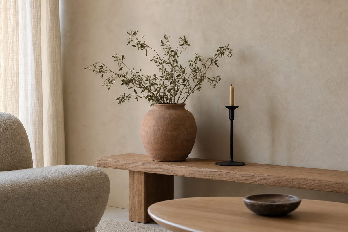
Every Japandi room you’ve saved to a moodboard is running the same quiet engine underneath: about five colors, in roughly the same proportions, doing very specific jobs. Once you see the system, you can walk into any room — including a white-walled rental — and know exactly what to change.
I live in a Tokyo apartment, which means I’ve spent years watching how actual Japanese homes handle color. The honest answer: mostly by restraint. Here’s the palette, translated into something you can take to a paint store or a furniture site.
The five colors
1. Warm off-white — the field. Not gallery white, not gray. Think unbleached cotton, rice paper, plaster with a drop of cream in it. This is 60% of the room: walls, bedding, the big soft surfaces. Cold blue-whites are the fastest way to make a “Japandi” room feel like a dentist’s office instead.
2. Mid-tone wood — the structure. Oak, ash, walnut in its lighter cuts. Furniture legs, floors, frames, trays. Around 20% of the room. The Japanese half of Japandi leans lighter (hinoki, ash); the Scandi half tolerates deeper walnut. Pick one family and stay in it — three different wood tones in one room reads as “furniture I accumulated,” not “furniture I chose.”
3. Clay — the warmth. A muted terracotta, somewhere between brick and milk tea. This is an accent, maybe 8%: a cushion, a vase, one chair, pottery. In Japanese interiors it shows up as unglazed ceramics and old kitchen earthenware, and it’s the color that keeps all that off-white from feeling anemic. I learned the 8% part the expensive way — I once bought a terracotta rug, a whole rug, and my living room instantly became a Mexican restaurant I’d happily rate four stars. Great restaurant. Wrong home. Clay is a seasoning, not a base.
4. Sage or moss green — the life. A grayed-down green — mint reads as candy in a quiet room, and forest green reads as a pub. Another 8%: a throw, dried stems, a print. It does the job plants do, in rooms where plants go to die. (If you have real plants, they count toward this budget.)
5. Ink — the punctuation. A near-black with warmth in it: think sumi ink rather than printer toner. The last 4%, and the most important: a lamp, a thin picture frame, iron hardware, a single dark bowl. Without ink accents the room floats; with them, everything else snaps into focus. This is the color people forget, and its absence is why so many attempts feel vaguely unfinished.
The proportions matter more than the colors
If you take one thing from this article: 60 / 20 / 8 / 8 / 4. Field, wood, clay, green, ink. You can nudge these — more wood in a furniture-heavy room, more green if you’re a plant person — but the ranking holds. The moment clay or green climbs above wood, you’ve left Japandi and entered “boho,” which is a fine place to live but a different country.
The other rule: saturation stays low everywhere. Every color on this list has gray in it. The palette test for any purchase is simple — would this color look at home on a linen shirt that’s been washed fifty times? If it’s brighter than that, it will shout in a quiet room.
The mistake that breaks the palette
Black-white contrast. A pure white wall with pure black furniture photographs dramatically and lives terribly — that’s showroom logic. Japandi’s calm comes from narrow value range: the darkest thing in the room (ink) and the lightest (off-white) are both softened toward the middle. Warm the white, soften the black, and the same furniture suddenly looks expensive.
Cheat sheet: five swatches to screenshot
- Field: warm off-white
#f6f2ec - Wood: light walnut
#a3875c - Clay: muted terracotta
#a86f4f - Green: dried sage
#8c9183 - Ink: warm near-black
#2a2622
These are the working values behind everything on this site. Match them loosely — the palette forgives approximation.
Start with whatever room bothers you most. Swap the coldest white thing for a warm one, group the wood tones, add one clay object and one ink object. That’s usually the entire renovation — and it costs about as much as a nice dinner.
Which of the five is missing from your room? My bet, sight unseen: the ink. Send me a photo if you disagree — I keep being right about this and I’d love to be wrong once.
— Sen
The 5 Japandi Principles (Free Cheat Sheet)
The five ideas that actually transfer from real Japanese homes — printable, one page, free.
Get the cheat sheet →